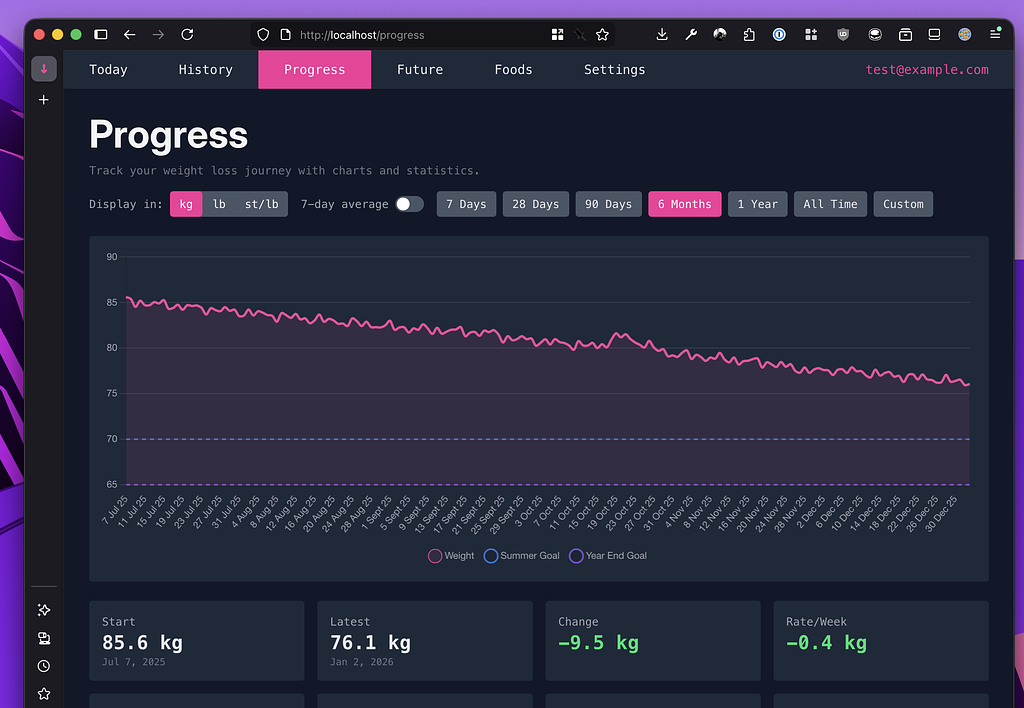
Sharing is caring

The progress chart now contains a Share button that makes it easy create an image for sharing with your contacts! It respects the settings you currently have displayed for the chart, so you can quickly change over to another measurement type or time range before sharing.

Feb 2026 changes

Nothing major this month, but a number of quality of life improvements.

  • The chart now correctly displays spacing between all points
  • Drag to select on the progress chart
  • Improved chart tooltips

Charts now show dates accurately spaced

Previously, the progress and projection charts spaced all your data points evenly across the graph — so if you logged on January 1st, January 2nd, and then February 15th, they'd all appear the same distance apart. This made trends look misleading, especially if you had gaps between entries.

Now, dates on the chart are spaced proportionally to real time. A two-week gap actually looks like a two-week gap. We also added subtle grid lines at month or week boundaries to make it easier to read, and date labels tilt slightly when you're viewing longer time ranges so they don't overlap.

Jan 2026 changes

Improvements

  • You can now easily toggle between measures on the goal edit screen
  • It is now easier to see on the Future screen that the various scenarios (slow/typical/fast) can be toggled on/off
  • Completed goals remain on the Future chart once you've reached them, allowing you to appropriately bask in your success

Fixes

  • Missing pounds value from chart when showing stone/pounds
  • Rounding error on the future screen meant the chart showed correctly, but the numbers below the chart would show 0 instead of 0.1 (or similar)

Dark mode

it's the progress page, but darker...

This ones fairly self explanatory, but there is now a dark mode for the entire site. You can toggle between the modes in the bottom right hand corner of the screen, and it defaults to matching your system settings.

I think it's all pretty-like, but if there's anything I've missed please get in touch.

History chart BMI gradients

there is a gradient here, i assure you

If you have you height entered in settings, the history graph now lets you choose BMI to display as the color option. Not so useful on a day-by-day basis, but when you have many months of data it can be a nice way of visualising your progress.

We're live!

After a final bit of polishing, we're now live to new signups. Please feel free to give it a go, there's what I hope is a generous free tier to see if weighted down works for you.

Thanks,
Rob

Export your own data

You can now request a data export directly from the settings page.

Exports will be automatically deleted after a week, and you can have up to 3 exports at once. All data is exported in a .csv format so you can easily import it to Excel or similar.